


It's Monday morning. You're the VP of Operations for a portfolio of 47 communities across five markets, and you need to figure out where to focus your attention this week.
All the data you need to make your decision—occupancy rates, collections performance, lead-to-lease conversion, marketing ROI—lives in EliseCRM. The problem? Getting from "the data exists somewhere in the system" to "here's exactly what I should prioritize today" means clicking through multiple dashboards, exporting reports, building comparison spreadsheets, and piecing together the story yourself.
By the time you've identified where the actual problems are, you've burned through half your morning. And you still need to figure out which issues are "watch closely" versus "drop everything and handle this now."
The irony is clear: the more data leaders have, the harder it can become to distill it into quick, actionable insights. That’s why EliseAI built the Portfolio Summary Dashboard. Gone are the days of data-driven paralysis, say hello to a color-coded, executive-ready view of performance that puts action items at the tip of your fingers. Let’s dive deeper.
.svg)

Introducing the Portfolio Summary Dashboard: Your EliseCRM Experience Will Never Be the Same

EliseCRM is a powerful platform, trusted by NMHC Top 50 multifamily operators like GoldOller Real Estate Investments to track every aspect of property performance from marketing ROI to leasing conversion rates by channel to historical collections data to agent productivity. But for senior leaders who need distilled and overarching insights into portfolio performance, that level of granularity can be overwhelming. When everything is measured, it can feel harder—not easier—to see the big picture.
The Portfolio Summary Dashboard is EliseCRM’s answer to that struggle, and it's coming soon.
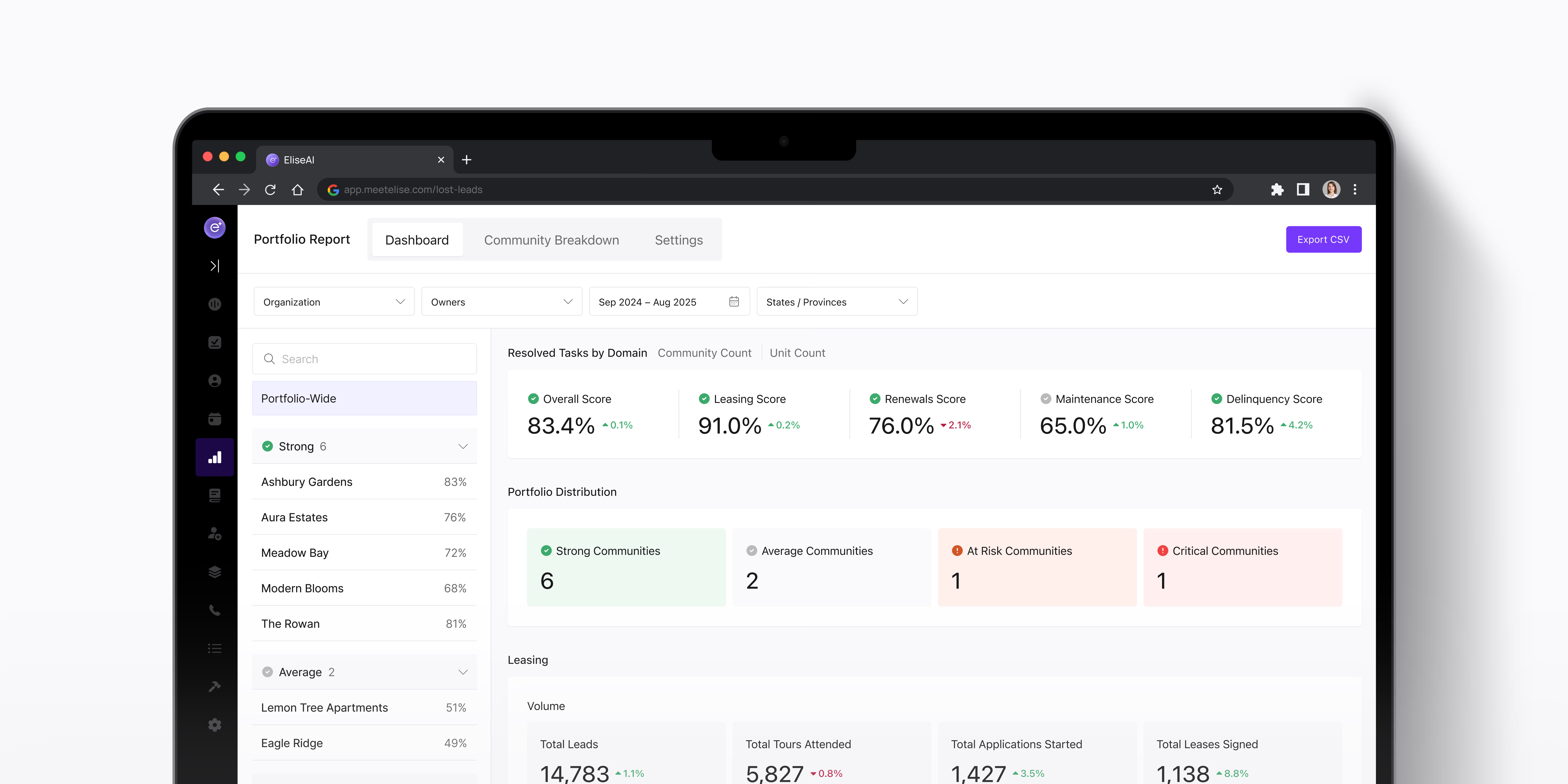
It’s a clean, intuitive interface that transforms complex property-level data into a single, actionable snapshot. With just a few clicks, leaders can view performance at any individual community or across your entire portfolio, with customizable time frames.
Key features include:
- Flexible Scope: Choose any date range and zoom in on a single community or view the entire portfolio at once.
- Color-Coded Health Scoring: Intuitive color coding (red is bad, yellow is okay, green is good) ensures performance issues stand out immediately.
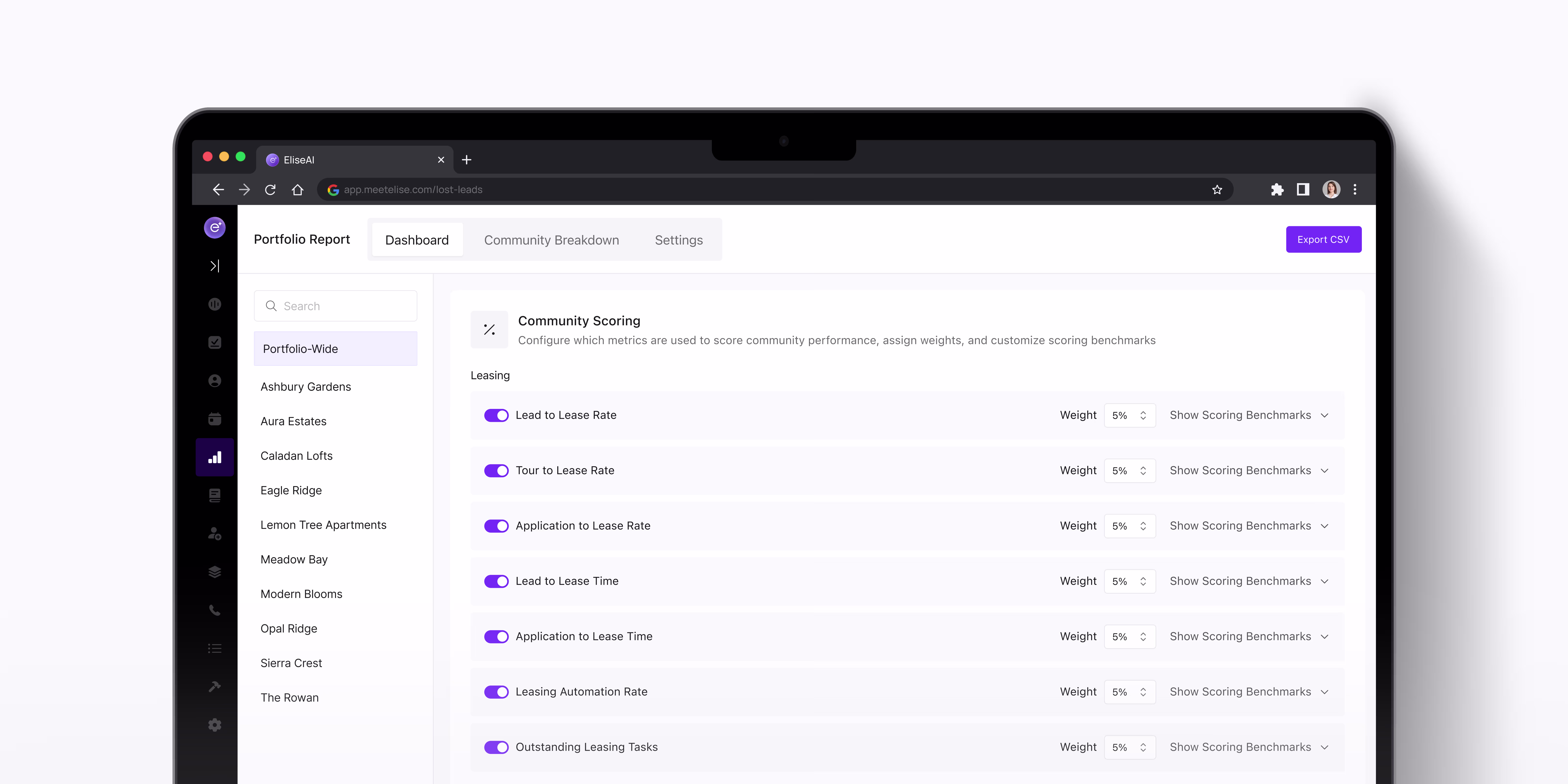
- Customizable Benchmarking: Define which KPIs matter most, and set thresholds that reflect your organization’s unique goals.
- Focus Area Alerts: The dashboard proactively highlights communities or metrics that demand attention, eliminating guesswork and making it simple to distill data into action items.
-
Instead of combing through reports and messy CSV files, executives now have the ability to operate at the 10,000 foot high vantage point that they need to make an impact at scale directly within the EliseCRM platform.


How It Works: The Features That Make the Difference
The Traffic Light System You Can Trust
Red, yellow, green. Three colors that tell you everything you need to know at a glance.
But here's what makes this different from every other "dashboard with colored indicators" you've seen: you decide what those colors mean.
With the Portfolio Summary Dashboard, you can customize performance thresholds for every metric that matters to your portfolio. Maybe 92% occupancy is your green threshold. Or collections above 95% by the 30th of the month is your standard. Maybe lead-to-lease conversion below 5% triggers a yellow flag. You define what "good," "needs attention," and "critical" actually mean for your communities.
The dashboard measures your properties against your internally defined standards, not some generic industry benchmark that may or may not reflect your portfolio strategy. Now, you can have complete and total confidence that pressing issues (with your own customizable definitions of “issues”) are flagged exactly when they need to be so you can take action.
This is the future of proactive portfolio management. You're not hunting for problems anymore, because your AI-powered command center flags them to you.
Definitions: The Feature Nobody Asks For (That Everyone Needs)
Stop me if this sounds familiar—someone asks about a metric in a meeting, and suddenly you're debating what that metric actually measures instead of discussing what to do about it. You might have your own internal shorthand or accepted terminology, but what about your software providers?
The Portfolio Summary Dashboard eliminates that conversation entirely. Click into any metric, and you get the precise definition of what you're looking at and how EliseCRM is calculating that figure. It sounds simple, but it means everyone in the room is looking at the same data the same way without ambiguity.
How The Portfolio Summary Dashboard Changes Your Day to Day
The Portfolio Summary Dashboard is built to help provide clarity when large amounts of data make determining action steps challenging. By giving you clear and granular focus areas based on customizable benchmarks, it answers the questions that actually determine how you spend your day.
Where should I focus my time today?
You're not guessing based on gut feel or responding to whoever emailed you most recently. The dashboard shows you which communities have crossed critical thresholds, which metrics are trending in the wrong direction, and which situations need immediate attention versus monitoring.
Which communities need intervention?
Not all problems are created equal. A yellow flag for collections at one property might be a temporary blip. A red flag at another might indicate a systemic issue with your onsite team. The dashboard gives you the severity coding and trend data to make that distinction quickly.
Where should we allocate resources?
Marketing budget decisions. Regional manager priorities. Whether to bring in additional leasing support at specific properties. These decisions require understanding comparative performance across your portfolio. The dashboard puts that comparison in front of you without building a single spreadsheet.
What's working that we should double down on?
It's not just about fixing problems. When three communities are significantly outperforming on lead-to-lease conversion, you want to know that too. What are they doing differently? Can it be replicated? Green flags matter as much as red ones.
What's trending wrong before it becomes a crisis?
This might be the most valuable question of all. Occupancy that's dipped half a point. Collections that are 1% off pace. Lead volume that's softening slightly. These aren't emergencies yet, but left unaddressed, can become them.
The Portfolio Summary Dashboard catches the early warning signs. You get to be proactive instead of reactive.
What's Coming Next
The Portfolio Summary Dashboard launching today is just the beginning. Continued improvements to data analysis capabilities are on the roadmap. The system will move beyond flagging issues to analyzing patterns across your portfolio, identifying correlations between metrics and surfacing insights that aren't immediately obvious from looking at individual data points.
Additionally, upcoming performance benchmarking capabilities will let you compare properties against each other and against comparable communities in your market. Which of your communities are outperforming their peers immediately around them? Which are lagging? You'll see it at a glance, and get the insights you need to either right the ship or replicate your success elsewhere.
The directive remains the same: turn the wealth of data in EliseCRM into executive intelligence that drives better, faster decisions across your portfolio.
Putting Your Data to Work for You
EliseCRM provides the most comprehensive operational dataset in property management—lead sources, conversion rates, collections trends, occupancy patterns, marketing ROI, agent performance—but it’s the Portfolio Summary Dashboard that makes that data instantly actionable.
No more Monday mornings lost to report assembly. No more hunting through screens to figure out what needs your attention. No more meetings derailed by debates over metric definitions. Just clear, immediate visibility into portfolio performance.
The dashboard transforms EliseCRM from a comprehensive data repository into a strategic command center. You can now spend your time making informed decisions with data, not manually aggregating that data—and that's what executive intelligence should look like.
Ready to see it in action?
Existing EliseCRM clients can contact their account manager to get access to the Portfolio Summary Dashboard. Not using EliseCRM yet? Get in touch via the form below to see how the platform (and this new dashboard) can change how you manage your portfolio.